Makeover Monday 2019/ Week 36: Fall is favourite season for most Americans
This week Makeover Monday community is looking at a chart about Americans’ favourite seasons from YouGov’s article.
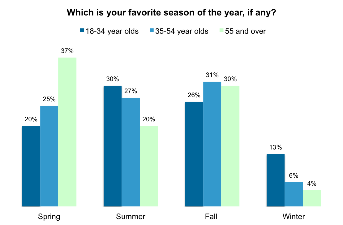
Which is your favorite season of the year, if any? / Chart by YouGov
Original Makeover Monday post and data set on data.world.
What works in this chart?
- It gives a clear breakdwon of preferences by season and age group.
- Using a question as a title helps audience to be more engaged with the visualization.
- It uses colours efficiently.
What can be improved?
- The absence of the total per season makes it difficult to answer the question in title.
- Totals for age groups don’t add up to 100%.
My take on the chart
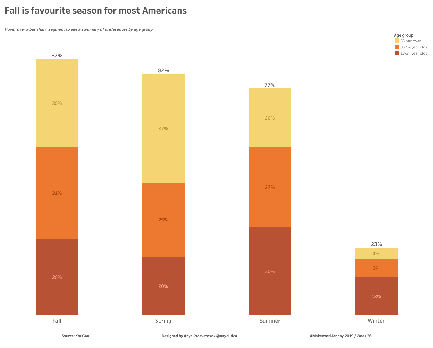
Fall is favourite season for most Americans / Designed by Anya Prosvetova
I decided to re-design the chart to make the answer to the title question more prominent, and turned it into a stacked bar. Now the main focus is the total preference per season, and each season bar is broken down further to show preferences for each season by each age group.
You can see the interactive version of this chart on my Tableau Public page.