Makeover Monday 2019/ Week 37: Which book series by James Patterson are more popular among the Seattle Public Library's readers?
This week Makeover Monday is about book checkouts in the Seattle Public Library. The original visualization shows book checkout numbers of Jane Austen’s novels in the library between 2007 and 2010. It was originally included in “Making Visible the Invisible. DataVis at the Seattle Public Library” presentation at the Culture Analytics Conference, 22 March 2016.
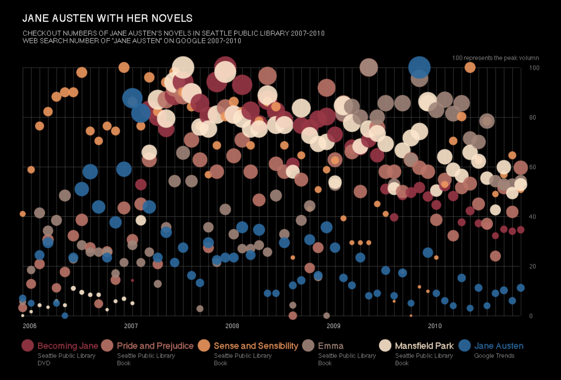
Jane Austen with her novels / Chart by the Seattle Public Library
The data set for this week, however, is an extract from the library’s database about monthly checkouts of books written by James Patterson.
Original Makeover Monday post and data set on data.world.
What works in this chart?
- It shows that certain books by Austen are more popular than other among library readers.
- It brings in Google Trends data on searches for “Jane Austen” in order to see if there is any correlation between the number of searches and the number of monthly book checkouts.
What can be improved?
- The chart’s legend is confusing.
- The colours used for book titles are quite close to each other, making it difficult to distinguish individual titles on the chart.
- The amount of checkouts / Google searches is encoded twice: in the size of a bubble and its position along the y-axis. That makes it difficult to see the trend over time as well as to correctly compare number of checkouts / searches from different periods.
My take on the chart
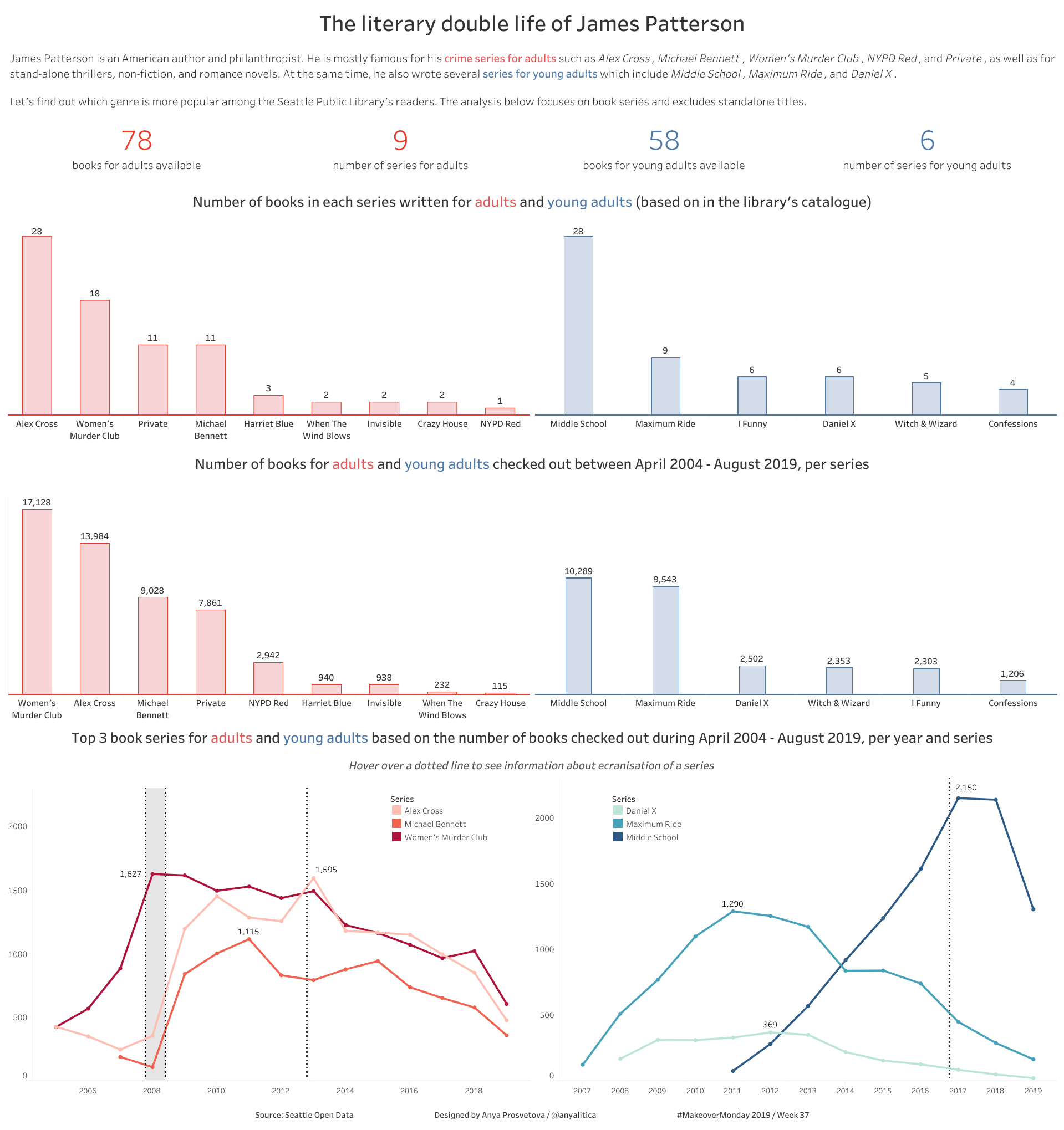
The literary double life of James Patterson / Designed by Anya Prosvetova
After learning more about James Patterson’s books, I thought it might be interesting to see how book checkouts of his crime series for adults compare to checkouts of series for young adults. This analysis excluded any standalone titles.
I chose bar and line charts for an easy comparison between two segments and looked at:
- The total number of books available from the library in each series.
- The total number of books checked out in each series.
- Comparison of top 3 series in each series type based on the number of checkouts between April 2014 - August 2019.
While working on this chart, I learnt that there were several film adaptations of James Patterson’s books and wanted to see if there is a connection between a TV / film release date and the number of checkouts of the relevant series around these dates. This is reflected on the line charts at the bottom of the dashboard.
You can see the interactive version of this dashboard on my Tableau Public page.