Makeover Monday 2019/ Week 38: How much is the events industry committed to the Sustainable Development Goals?
For Week 38 Makeover Monday partnered with Positive Impact Events to look at how the events industry is responding to the United Nations Sustainable Development Goals. The original dashboard shows results of the survey conducted by Positive Impact Events.
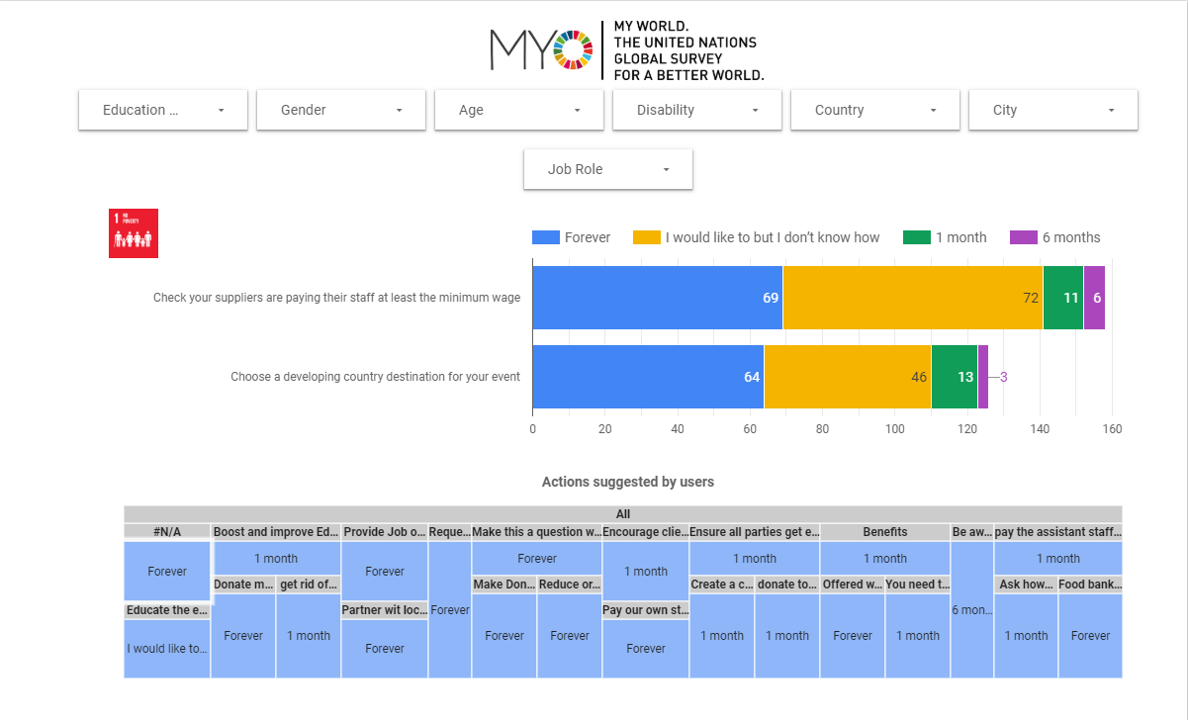
Commitments from the Event Industry for the Sustainable Development Goals / Dashboard by Positive Impact Events
Original Makeover Monday post and data set on data.world.
What works in this chart?
- It allows to focus on one goal at a time.
- It presents a variety of filters at the top so a user could explore answers from a certain audience segment.
- Good choice of colours makes it easier to distinguish between different answers.
- Stacked bar chart makes it easier to compare answers breakdown for each question.
What can be improved?
- There is no explanation about how the survey was designed and conducted.
- There is no immediate explanation of what the answers mean (‘forever’, ‘1 month’, ‘6 months’, ‘I would like to but I don’t know how’).
- There is no indication of what values are shown on the x-axis.
- It’s almost impossible to compare answers for different goals as they are too spread out on the dashboard. That also makes filtering complicated as you would need to scroll back and forth to see filtered results.
- “Actions suggested by users” treemap is difficult to read as suggested actions are not displayed in full.
My take on the chart
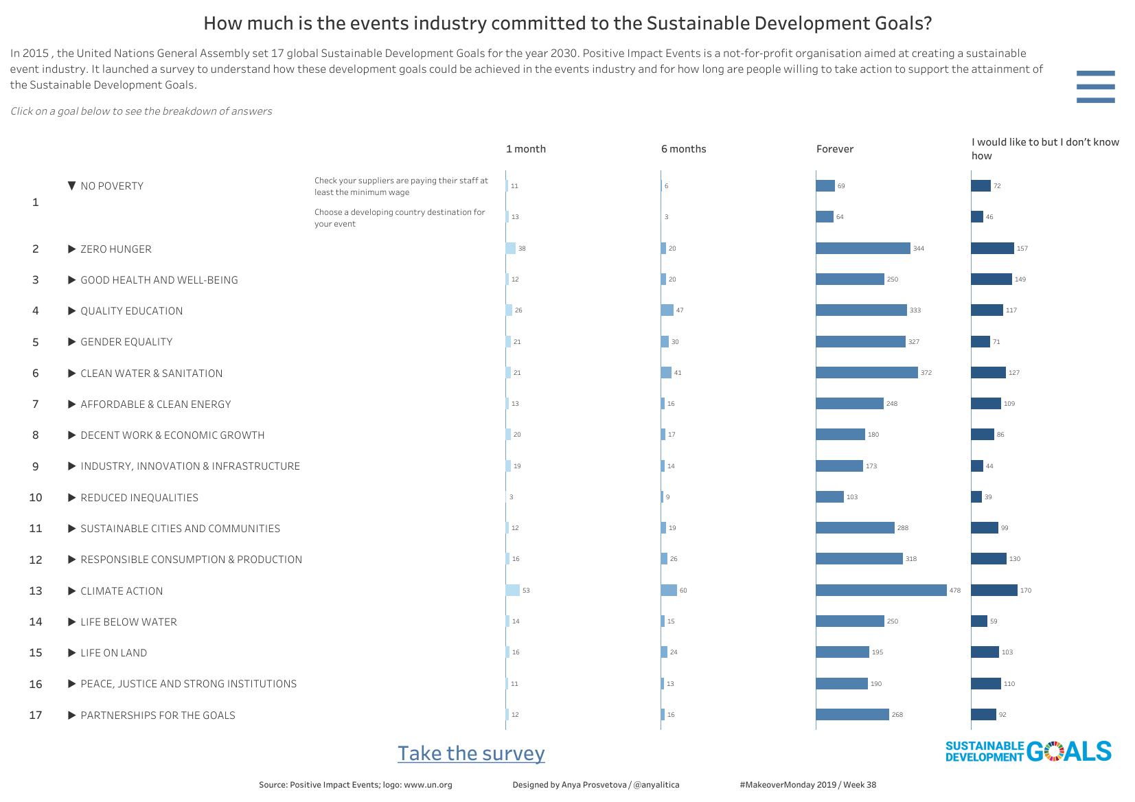
How much is the events industry committed to the Sustainable Development Goals? / Designed by Anya Prosvetova
For my makeover I wanted to create a compact version of the dashboard to make comparison between goals easier. The bar charts use a gradient colour palette that allows to distinguish between four answers but doesn’t distract from the overall picture.
I also wanted to practice a drill-down with set actions feature here: clicking on an individual goal’s description on the left shows a breakdown of answers for two survey questions.
There is also an option to filter the dashboard based on the gender, job role, education level, country, and disability of the respondents. The filter menu can be opened by clicking on the hamburger menu button in the top right corner of the viz.
You can see the interactive version of this dashboard on my Tableau Public page.