Makeover Monday 2019/ Week 41: Donations to the Top 3 Political Parties: Institutions vs Individuals
This week the Makeover Monday community is redesigning a visualisation from The Electoral Commission’s website. It shows the amount of donations accepted by political parties in Great Britain and Northern Ireland between 2001 and 2019.
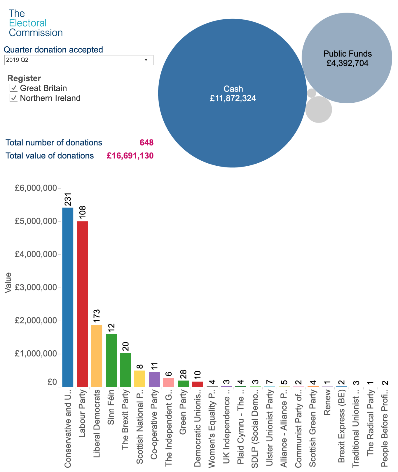
Donations Accepted By Political Parties in Great Britain and Northern Ireland / Courtesy of The Electoral Commission
Original Makeover Monday post and data set on data.world.
What works in this chart?
- It shows a significant difference between the amount of cash and public funds donations.
- The bar chart shows the top parties ranked by the amount of donations accepted.
- A small table above the bar chart shows the total number of accepted donations and their total amount.
- Date filter gives an opportunity to explore donations during a particular period.
What can be improved?
- There are too many different charts combined together on this dashboard; it’s difficult to understand what is the focus of this viz.
- Labels on the bar chart should be placed horizontally under the chart to make them more legible.
- There is no indication on the bubble chart of what other donation types have been received in addition to cash and public funds.
- It would be interesting to see a timeline of donations and how their size and recipients changed over time.
My take on the chart
I wanted to focus on the 3 parties that received the largest number of donations as of today: Conservative and Unionist Party, Labour Party, and Liberal Democrats. Using stacked bar chart, I showed the change in the donations’ size over time, between 2001 and 2019. The middle part of the dashboard outlines different types of donations. Two bar charts at the bottom compare donations by top 10 institutional and private donors.

Donations to the Top 3 Political Parties: Institutions vs Individuals / Designed by Anya Prosvetova
You can see the interactive version of this dashboard on my Tableau Public page.