Makeover Monday 2019/ Week 42: Median winning time in hours for men and women in the Ironman World Championship, 1978 - 2019
Another week, another Makeover Monday. This time I was doing it as a part of DS17 cohort at The Data School, and it’s my first submission that I actually managed to complete on Monday. This week we looked at the Ironman World Championship’s winners from 1978 to 2019 using the dataset from the competition’s Wikipedia page.

Medallists of the Ironman World Championship / Courtesy of Wikipedia
Original Makeover Monday post and data set on data.world.
What works in this chart?
- The chart is great if you want to see information about a certain year of the competition.
What can be improved?
- Providing an overview of the winners, the table doesn’t allow to explore the data further (for example, to see the top performers, group the results by country gender).
My take on the chart
For this week I decided to look at how median winning times for women and men compare across countries and medals using a dumbbell chart. To calculate the hours, I’ve split the original Time column in Tableau Prep into 3 parts by colon (hours, minutes, seconds), converted hours and minutes into seconds, and summed these with seconds from the original time. Once I had the total time in seconds, I converted it into hours for cleaner visualisation. I also decided to start the x-axis from 7 rather than 0 to increase legibility of the chart.
You can see the complete list of athletes from each country by gender when you hover over a dot on the chart.
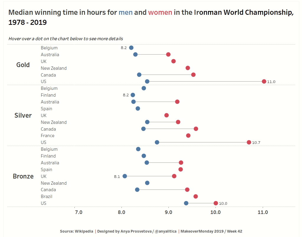
Median winning time in hours for men and women in the Ironman World Championship, 1978 - 2019 / Designed by Anya Prosvetova
You can see the interactive version of this dashboard on my Tableau Public page.