Makeover Monday 2020/ Week 1: Football is consistently America's favourite sport to watch
The first Makeover Monday challenge for 2020 looks at a chart about America’s favourite sport to watch published in Vox.
The original chart below shows the top three answers to a Gallup survey question for the period from 1940 to 2010, however the data for this week’s challenge covers the period between 2004 - 2017.
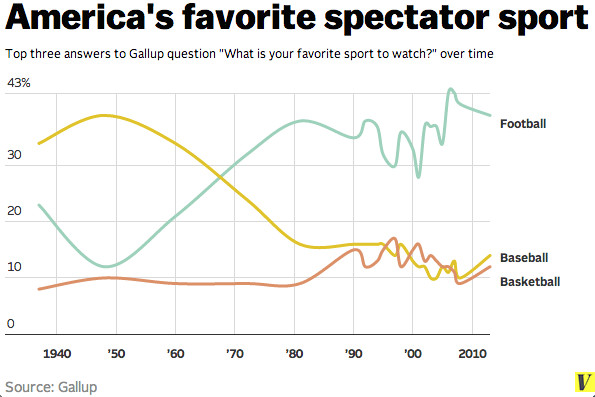
America's favorite spectator sport / Courtesy of Gallup
Original Makeover Monday post and data set on data.world.
What works in this chart?
- The chart works if you want to see the change in answers over time.
- It also clearly shows the increased interest in watching football since the 1960s.
What can be improved?
- The line chart doesn’t allow to explore the data further or compare these three sports with other sports covered in the survey.
My take on the chart
For this week I decided to create a bump chart. This type of chart shows the change of categories over time –similar to a line chart– but focuses on the ranking of the categories relative to each other.
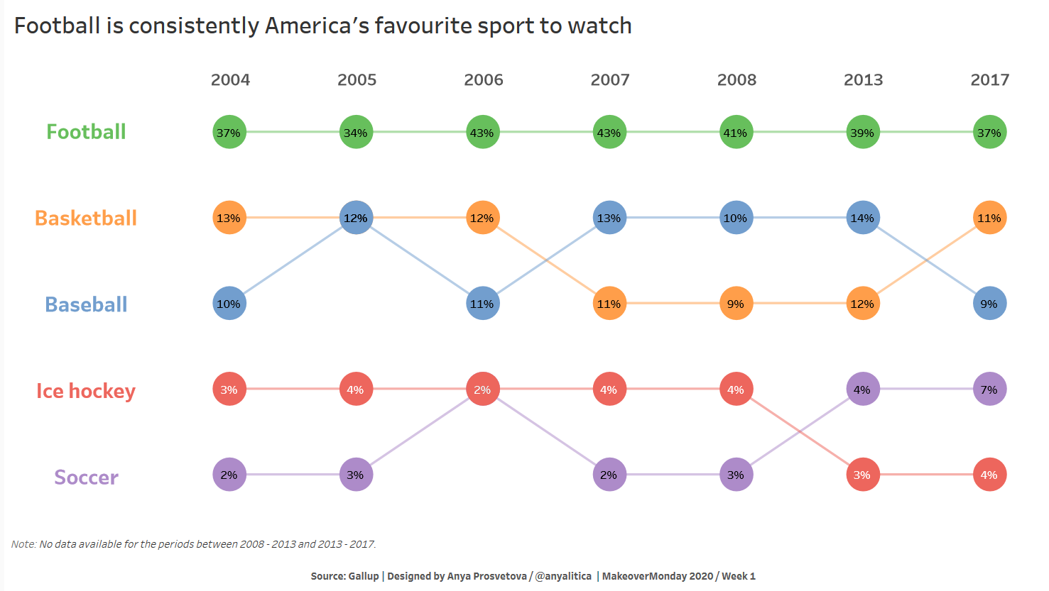
The final view of my dashboard
To design my submission for this week, I took the following steps:
-
After bringing the data set to Tableau Desktop, I pivoted the table from columns to rows to have one column for a year of the survey and another for the responses.
To do so, in the “Data Source” tab in Tableau select the columns you need to pivot holding the Ctrl key (in this case, these are columns 2004, 2005, etc.). Once selected, right-click on the header of any of the selected columns, and select “Pivot” from the drop-down menu.
Now you should have two new columns: Pivot Field Names (in this case years) and Pivot Field Values (in this case responses). In other words, you should have three columns now: Year, Value, and Sport.
-
Then, I opened a new worksheet and created a calculated field called Ranking:
RANK(SUM([Value]), 'desc')
-
To build the chart, I put the Year field to the Columns shelf, the Ranking field to the Rows shelf, and the Sport field to the “Detail” card on the Marks card. For my dashboard, I wanted to focus on 5 sports only, so I added the Sports field to the “Filters” shelf.
-
As ranking is a table calculation, we need to specify how it should be computed. To do so, click on the Ranking field on the Rows shelf and select “Edit table calculation”. In the dialogue, select “Compute using” > “Special Dimension” > “Sport”. After I set the calculation, I duplicated the Ranking field on the Rows shelf by holding the Ctrl key and dragging the field to the right next to the original Ranking field.
-
Then I created a dual axis chart by clicking on one of the Ranking fields on the Rows shelf and selecting “Dual axis”. After, I synchronized the axes by right-clicking on any of the axes and selecting the “Synchronize axis” option.
-
To make the chart look like a bump chart, I changed the type of the first Ranking field to be a line chart and the second one to be a circle.
-
I spent some time selecting a good colour palette for this chart. Originally, I didn’t want to have too many colours in the viz, but as all sports are different from each other, it might be confusing the use similar colours or different hues of the same colour as it might visually create a connection between sports. So, I decided to use five different colours to avoid any confusion.
-
To finish the chart’s formatting, I added labels on the circle chart to show the actual percentage of responses. Also, I wanted to move years to the top of the chart. For this, I created a new worksheet called “Years”, where I put the Year field to the Columns shelf as well as to the “Text” card on the Marks card.
-
I took a similar approach to create the coloured labels for different sports on the left of the chart. I created a new worksheet called “List”, where I put the Sport field to the Rows shelf as well as to the “Text” and “Colour” cards on the Marks card.
-
Once all three worksheets were ready, I put them together to design my final dashboard.
You can see the interactive version of this dashboard on my Tableau Public page.
Let me know if you have any questions.